A Brand Evolving Year-on-Year
Each year, the Design Leaders Conference builds upon what came before – growing stronger through shared knowledge, creativity and leadership. Our brand has been designed to evolve, reflecting the compound effect of learning and experience. Rather than starting anew, we continue to refine and expand on the story we’ve been telling – one that honours our heritage while embracing change.
By weaving each year’s theme into the brand, we’re not only celebrating Ireland’s legacy but also charting a path forward – creating a visual identity that will continue to evolve, reflecting continuous learning and growth, year after year.
Evolving Visual Language
Our 2026 visual identity continues to bridge heritage and innovation.
At its heart, the brand’s visual identity remains deeply connected to our Irish heritage, grounding the brand in symbols and icons that represent our rich cultural roots. We’ve reimagined these elements in a bold, modern way, capturing the strength and confidence of Ireland’s design community.
The deep green represents our Irish heritage, grounded confidence and enduring leadership in design. Complemented by a sharp neon green, this palette speaks to innovation, growth and the courage to push boundaries. We’re also working to ensure that our designs align with our commitment to sustainability –with reusable materials where possible, colours and patterns that have a lower carbon impact and a general approach that seeks to minimise waste and enhance efficiency. This conscious choice reflects our values, where every element contributes to a better, more sustainable future.
Our visual identity reflects moving with the future changes of our industry through dynamic and upward movement motifs – symbols of forward momentum and pushing boundaries.
The visual language draws on the textures and movements of our island – from wind and waves to the fluidity of sand. This ties into Ireland’s island position, where sand and the sea are central to our cultural and natural identity. The sand pattern mirrors the idea of moving forward and returning to the sea, much like the increasing trend of embracing water sports and cold swims.
The use of a sand texture symbolises both the ever-shifting nature of design and the importance of shifting through change and complexity to find the most relevant knowledge. Just as the sand shifts and is shaped by the sea, the conference guides leaders in navigating an evolving industry, helping them focus on what truly matters.

2026: Mega Trends
This year, the Design Leaders Conference brand identity is centred on the theme of Mega Trends – exploring how design leadership can navigate the defining forces of our time: new technologies, climate change, inequality and shifting demographics.
Like last year, movement is a defining motif – translating the natural flow of the Irish landscape (wind, sand and waves) into dynamic, data-inspired forms. These visual cues echo the forces shaping our industry: digital transformation, environmental urgency and human adaptation. The result is a brand that feels alive – forward-moving, confident and continually evolving.
By drawing on the strength of Irish creativity and innovation, we’re inviting leaders to harness the trends of the future to adapt and turn it into transformative growth in their design practice.
A Modern Take on Heritage
Our logo design remains, subtly incorporating elements of traditional Irish symbolism, offering a modern take on heritage. Inspired by Celtic knots and continuous patterns, it reflects the idea of connectedness, growth and leadership. It's a mark of confidence and continuity, yet forward-thinking enough to stay relevant year after year.
The logo also integrates subtle references to Irish design history, bridging the old and the new to create a symbol that speaks to both our roots and future aspirations.


Celebrating Irish Design Craftsmanship
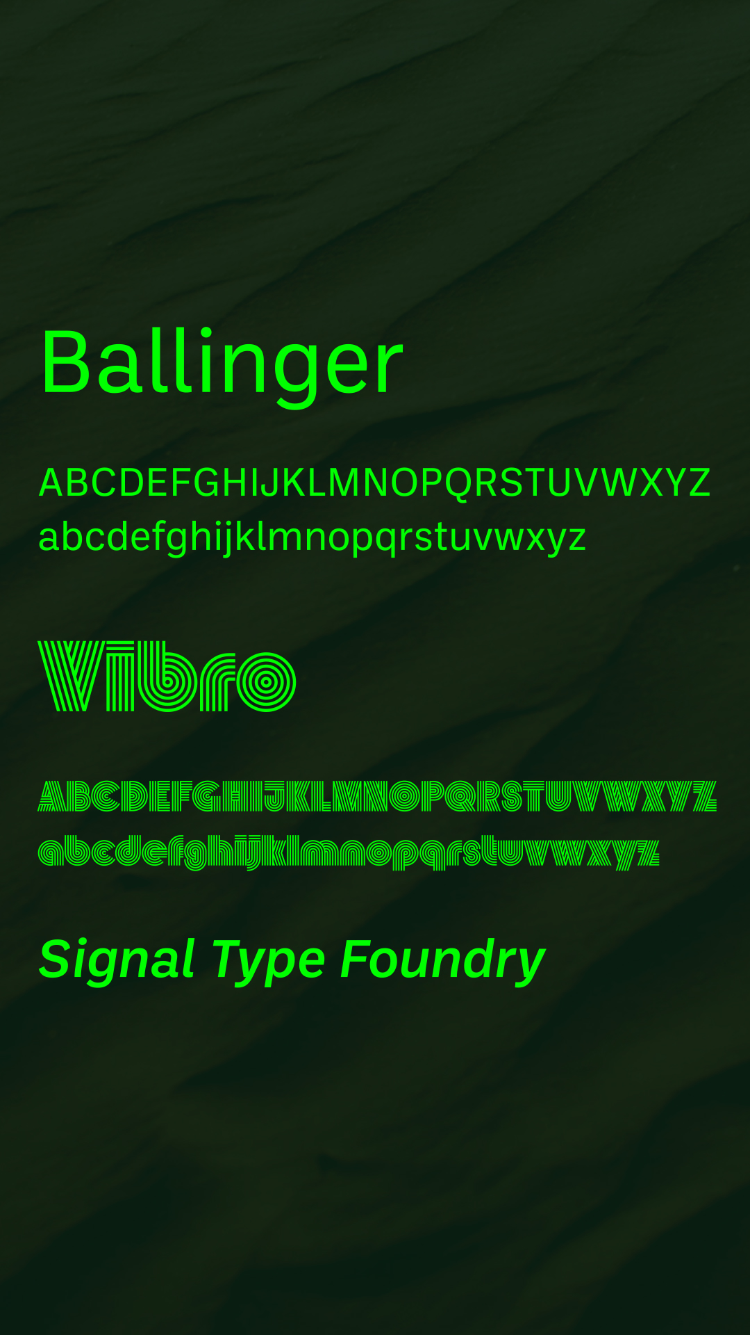
Typography remains central to our identity. We continue to champion Irish type design by using Irish fonts in our branding, further celebrating the talent within Ireland’s design scene. We’re proud to feature typefaces created by Max Phillips of Signal Type Foundry, whose work reflects the same commitment to creativity and craftsmanship that drives our conference. These fonts add a uniquely Irish character to our brand, merging tradition with contemporary design.
The aim was to celebrate Irish talent, leading to the selection of two fonts by Max Phillips and Signal Type Foundry. Ballinger was chosen for its clarity, which ensures messages are conveyed with precision and simplicity.
Complementing Ballinger is Vibro, described by Max as "designed by an old hippy for maximum dazzle." It's lively and dynamic and injects energy into the brand. Although Celtic ornamentation wasn't a primary focus during its creation, the subtle stripe patterns within Vibro evoke a sense of traditional Celtic design.
Find out more about the Design Leaders Conference typefaces on signalfoundry.com
Leading Through Change
At its core, the 2026 Design Leaders Conference invites leaders to embrace the power of creativity as a force for transformation. We draw on the strength of Irish design – rooted, resilient, and brave – to explore how we can harness the mega trends of our time to lead with purpose and design for impact.
By looking ahead while staying grounded in who we are, we continue to evolve a brand and a community built for what comes next.


